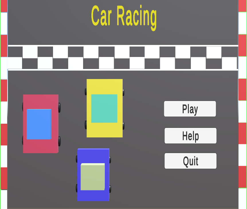
UX Assessment 2
This greybox prototype project was developed using UX best practices. I have used consistent layouts and navigation throughout the project. I have used lighter colours on buttons as the background is dark and the user can clearly identify the functions. In the Object scene, I have used buttons on the left-hand side, right-hand side and at the bottom of the screen. I have grouped some functions together here. So that user is comfortable with button functions. If I put all the buttons together, then the user may get confused with the button functions and to avoid that I have grouped buttons separately. I have added hover effects to the buttons so that users can easily identify the system changes. On the other hand, I have included a help button in case the user wants to know how to interact with my application. Users can press the Quit button at any time to exit the application.
Comments
Log in with itch.io to leave a comment.
Loved it, nice background,
nice usage of color.
But buttons are not visible, need to go full screen to see them.
When I press rotate left it rotates up and down when I press rotate right.
Hey viran, your assignment is quite good. i love the background which is very attractive. Your car objects are okay but not up to the marks it would have been designed much better by using probuilder. Color combination is also fine.
now talking about the User Interface and User Experience which are not up to the mark.
when we minimize Buttons in both menu and in game scene are not visible which can be solved by fixing it to fit with size.
overall project is quite good but need to solve the buttons issue , UI and UX.
thanks
Hi Viran, you have done a good job. I really like your menu scene. The color combination that you have used in the menu is really nice and eye-catching and also the background objects are nicely developed. I think if you can use any other fancy font style for the title in the menu it would make it more attractive.
You have used hovering effects on all buttons in your game which make it more distinguishable and to keep consistency across all scenes.
I like the way you used road image in your game seen. It gives the feeling of car racing.
I think the buttons used in the game scene are a little bit big when compared to your background scene.
Thank you.
as you grouped buttons its good idea but you used two cars and your cars are not touched to road it seems to one upon another